Packaging Design
G FUEL City Series — Los Angeles Aura
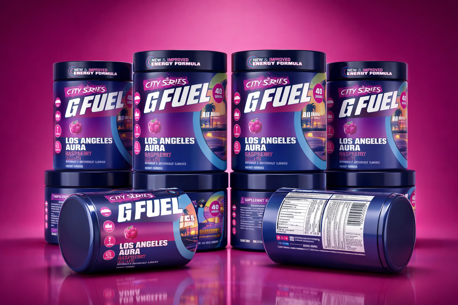
A limited-edition City Series tub that had to feel like Los Angeles in a single glance — neon sunset, palm silhouettes, and a raspberry “LA Aura” flavor — while staying 100% retail and print-ready as a shrink sleeve.
The Challenge
G FUEL’s City Series lives or dies on instant recognition. The Los Angeles edition needed a design that captured a specific city mood — retro sunset, Hollywood, poolside vaporwave — without losing the bold, energetic G FUEL brand system.
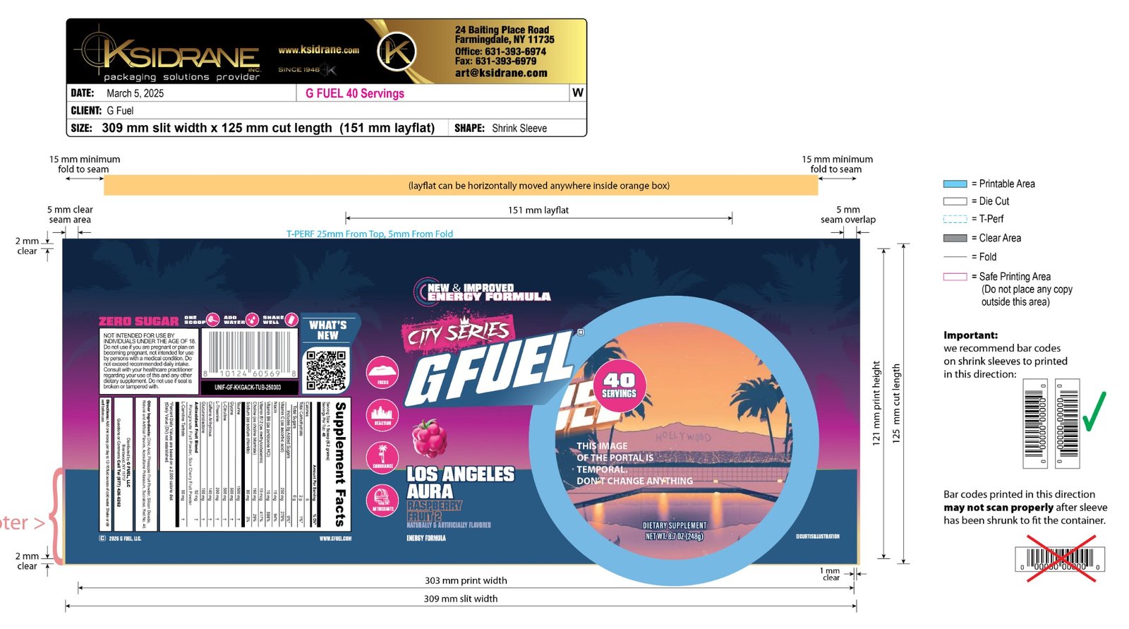
On top of that, it had to wrap cleanly onto a shrink sleeve. That meant every element had to survive the curve, the seam, and the shrink of the container without breaking — all while staying inside strict safe-print areas.
Our Solution
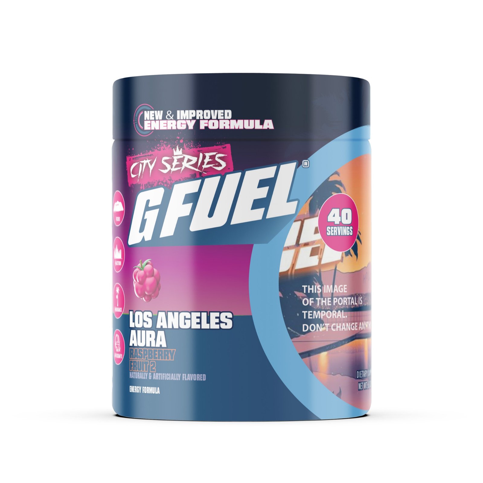
We built a full City Series LA concept around a warm-to-cool gradient — sunset orange into raspberry pink into deep night blue — with a layered palm-and-skyline scene and the signature G FUEL wordmark locked over a bold “City Series” tag.
- Retro LA sunset artwork with palms, Hollywood hills, and a poolside glow
- Raspberry “LA Aura” flavor identity with matching fruit and colour cues
- Bold, legible benefit callouts — Focus, Reaction, Endurance, Antioxidants
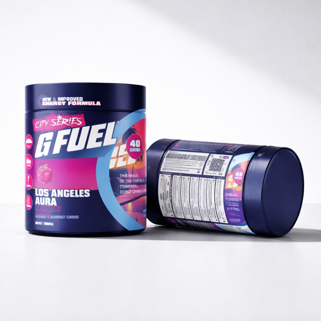
- Print-ready shrink sleeve built to spec — safe areas, bleed, and seam allowance
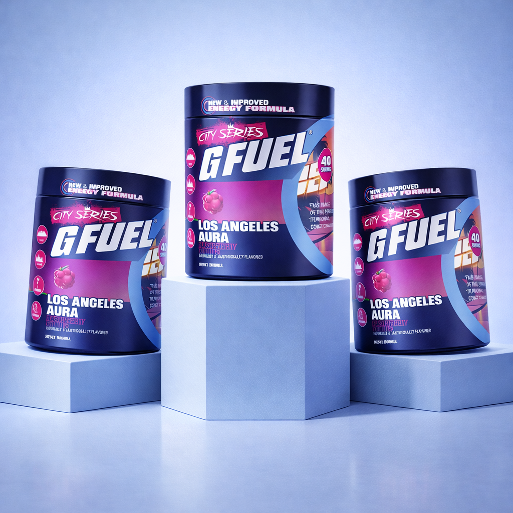
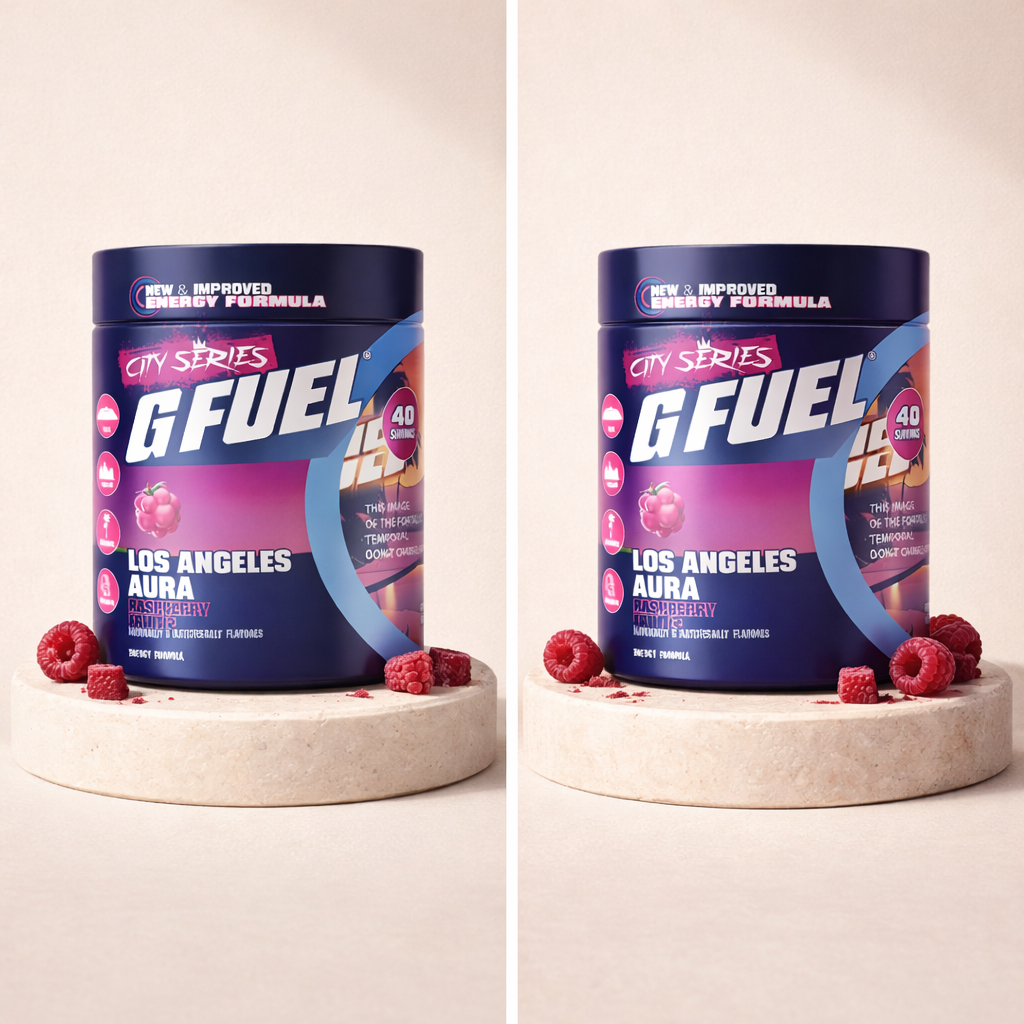
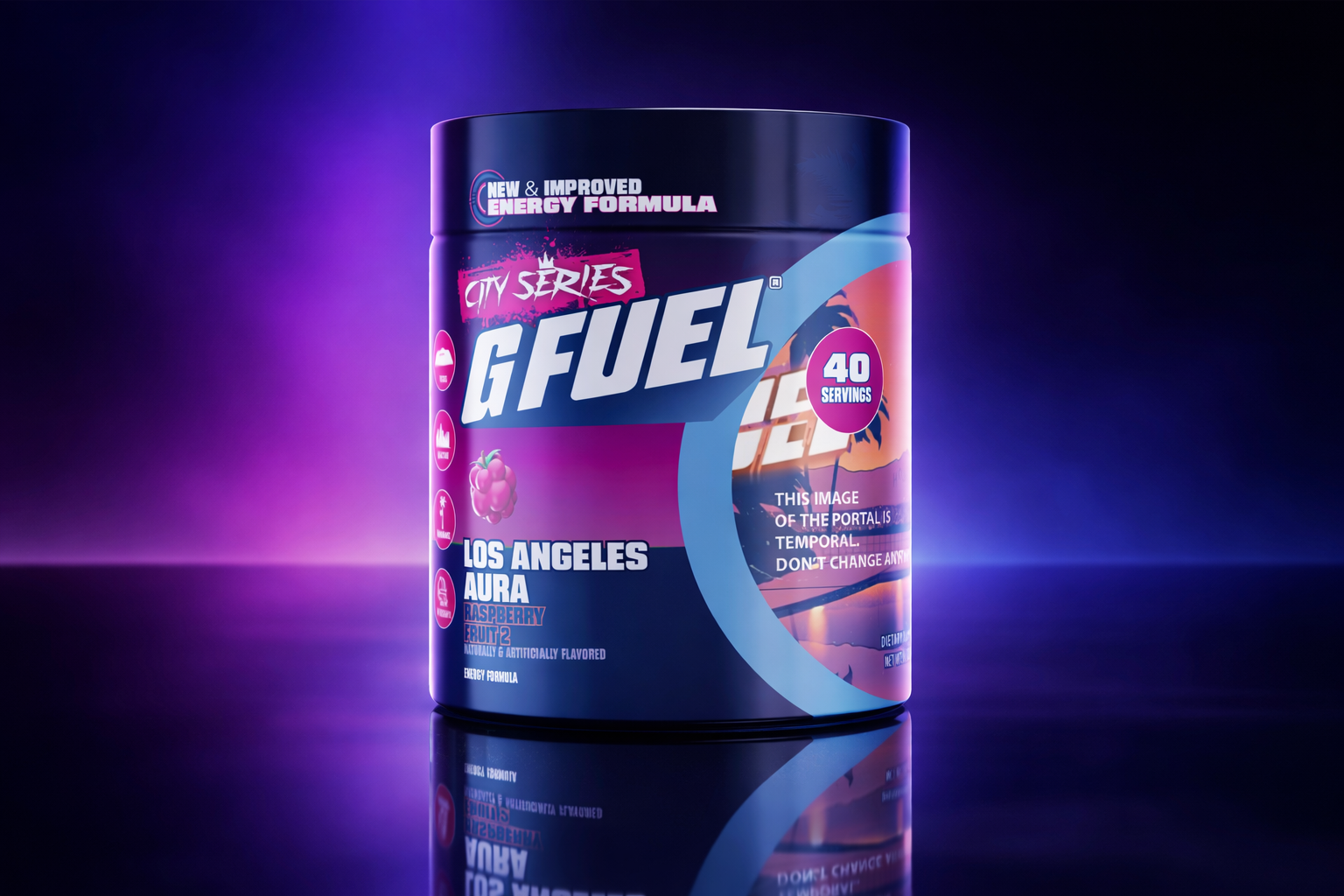
- Photoreal 3D tub mockup for launch, ads, and the product page
The Result
A launch-ready City Series tub that looks premium on shelf and in the thumbnail — and a clean, press-approved shrink sleeve that printed right the first time.
The layered LA concept gave G FUEL a distinct edition that still reads instantly as part of the family, and the 3D mockup gave the marketing team a hero visual for launch across ads, email, and the product page.
“Umair Studio nailed the LA vibe instantly and delivered files that were completely production-ready.”
 Aron LaikinG FUEL — City Series
Want Packaging Like This?
Book a free 30-minute call and let’s map out a design that makes your brand impossible to scroll past.
Book a Free Call