All Articles

Amazon Tips

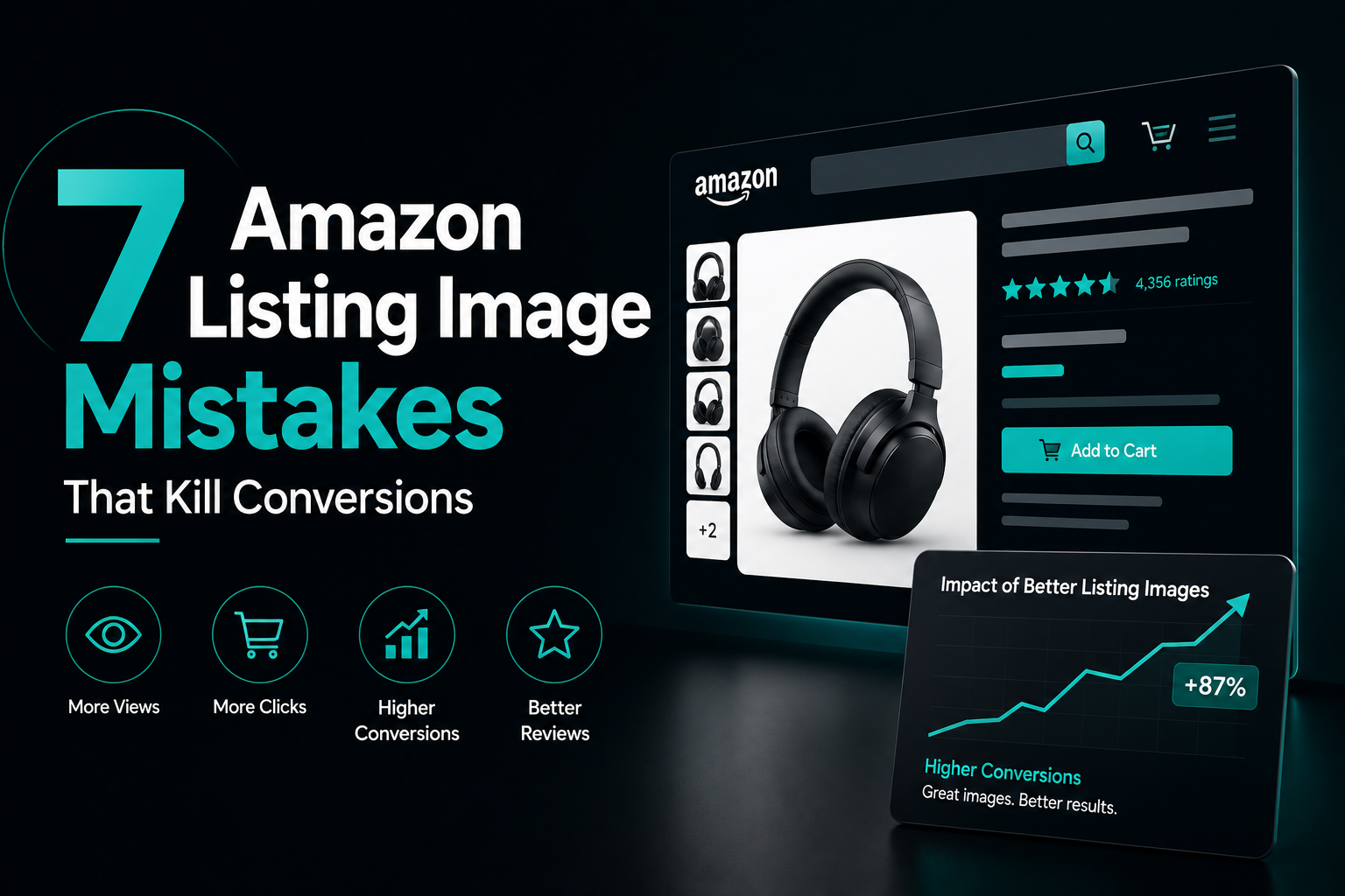
7 Amazon Listing Image Mistakes That Kill Conversions

On Amazon, most listings lose the sale in the thumbnail — before a shopper ever reads a word. These are the seven image mistakes we fix most often, and exactly what to do instead.

7 Amazon listing image mistakes that kill conversions

Your main listing image has one job: earn the click. Shoppers scan a grid of thumbnails in seconds, and the image that reads clearly at small size usually wins — regardless of which product is actually better. Get the image wrong and even a great product with a low price will get scrolled past.

After auditing hundreds of Amazon listings, the same handful of image mistakes come up again and again. Here are the seven that cost the most sales, and what to do instead.

1. The Product Is Too Small in the Frame

The single most common mistake. Sellers leave huge empty margins, so the product looks tiny in the thumbnail and loses to competitors who fill the frame. Amazon recommends the product fill about 85% of the image area. Zoom in until it nearly touches the edges.

2. A Cluttered Main Image

Your main image must be the product on a pure white background — no badges, no text, no props, no lifestyle scene. Not only is this Amazon’s rule, it also reads cleaner in search. Save all the extras for your secondary images, where they belong.

3. Not Designing for the Thumbnail First

An image can look stunning at full size and disappear completely in the small search thumbnail. Most shoppers decide there. Always shrink your main image down to thumbnail size and ask one question: is it instantly clear what this is?

“If your image only works when it’s big, it doesn’t work. The thumbnail is where the sale is won or lost.”

4. Secondary Images That Waste the Space

The main image earns the click; the secondary images close the sale. Yet most listings fill them with more angles of the same product. Instead, use each slot to answer a buyer’s real questions:

  • Key benefits. Turn features into clear, visual benefit callouts.
  • Scale and size. Show the product in context so buyers know exactly how big it is.
  • What’s in the box. Remove doubt about exactly what they receive.
  • Lifestyle in use. Help the buyer picture the product in their own life.

5. Text That’s Too Small to Read

Infographic images are powerful — but only if the text survives on a phone screen, where the majority of Amazon shopping happens. Use short punchy callouts and large, high-contrast type. If you have to squint, so will your customer.

6. Low-Quality or Inconsistent Images

Blurry photos, mismatched lighting, and a different style on every image quietly destroy trust. Your image set should feel like one confident brand — consistent colours, lighting, and layout across all of them. Amazon also allows zoom, so upload high-resolution images (at least 1600px on the longest side).

7. No Mobile-First Thinking

More than two-thirds of Amazon shoppers browse on mobile. If your images were designed on a big monitor and never checked on a phone, you are optimising for the wrong screen. Review every image on an actual phone before you publish.

Fix the Images, Lift the Conversion

You don’t need a bigger ad budget to sell more — often you just need images that do their job. Fixing even two or three of these mistakes can lift click-through and conversion at the same time, which compounds across every visit to your listing.

Amazon Tips Listing Images Conversion CTR

Want This Done For Your Brand?

Book a free 30-minute call and we’ll review your packaging together — no pitch, just honest feedback.

Book a Free Call
All Articles

Amazon Tips

7 Amazon Listing Image Mistakes That Kill Conversions

On Amazon, most listings lose the sale in the thumbnail — before a shopper ever reads a word. These are the seven image mistakes we fix most often, and exactly what to do instead.

Amazon listing image mistakes that kill conversions

Your main listing image has one job: earn the click. Shoppers scan a grid of thumbnails in seconds, and the image that reads clearly at small size usually wins — regardless of which product is actually better. Get the image wrong and even a great product with a low price will get scrolled past.

After auditing hundreds of Amazon listings, the same handful of image mistakes come up again and again. Here are the seven that cost the most sales, and what to do instead.

1. The Product Is Too Small in the Frame

The single most common mistake. Sellers leave huge empty margins, so the product looks tiny in the thumbnail and loses to competitors who fill the frame. Amazon recommends the product fill about 85% of the image area. Zoom in until it nearly touches the edges.

2. A Cluttered Main Image

Your main image must be the product on a pure white background — no badges, no text, no props, no lifestyle scene. Not only is this Amazon’s rule, it also reads cleaner in search. Save all the extras for your secondary images, where they belong.

3. Not Designing for the Thumbnail First

An image can look stunning at full size and disappear completely in the small search thumbnail. Most shoppers decide there. Always shrink your main image down to thumbnail size and ask one question: is it instantly clear what this is?

“If your image only works when it’s big, it doesn’t work. The thumbnail is where the sale is won or lost.”

4. Secondary Images That Waste the Space

The main image earns the click; the secondary images close the sale. Yet most listings fill them with more angles of the same product. Instead, use each slot to answer a buyer’s real questions:

  • Key benefits. Turn features into clear, visual benefit callouts.
  • Scale and size. Show the product in context so buyers know exactly how big it is.
  • What’s in the box. Remove doubt about exactly what they receive.
  • Lifestyle in use. Help the buyer picture the product in their own life.

5. Text That’s Too Small to Read

Infographic images are powerful — but only if the text survives on a phone screen, where the majority of Amazon shopping happens. Use short punchy callouts and large, high-contrast type. If you have to squint, so will your customer.

6. Low-Quality or Inconsistent Images

Blurry photos, mismatched lighting, and a different style on every image quietly destroy trust. Your image set should feel like one confident brand — consistent colours, lighting, and layout across all of them. Amazon also allows zoom, so upload high-resolution images (at least 1600px on the longest side).

7. No Mobile-First Thinking

More than two-thirds of Amazon shoppers browse on mobile. If your images were designed on a big monitor and never checked on a phone, you are optimising for the wrong screen. Review every image on an actual phone before you publish.

Fix the Images, Lift the Conversion

You don’t need a bigger ad budget to sell more — often you just need images that do their job. Fixing even two or three of these mistakes can lift click-through and conversion at the same time, which compounds across every visit to your listing.

Amazon Tips Listing Images Conversion CTR

Want This Done For Your Brand?

Book a free 30-minute call and we’ll review your packaging together — no pitch, just honest feedback.

Book a Free Call