Amazon Tips
Amazon A+ Content Design: The Complete Guide to Higher Conversions
A+ Content is one of the few free levers on Amazon that reliably lifts conversions — when it’s designed well. Here’s exactly what great A+ Content design looks like, and how to build it to sell.
 25 July 2026
8 min read
25 July 2026
8 min read
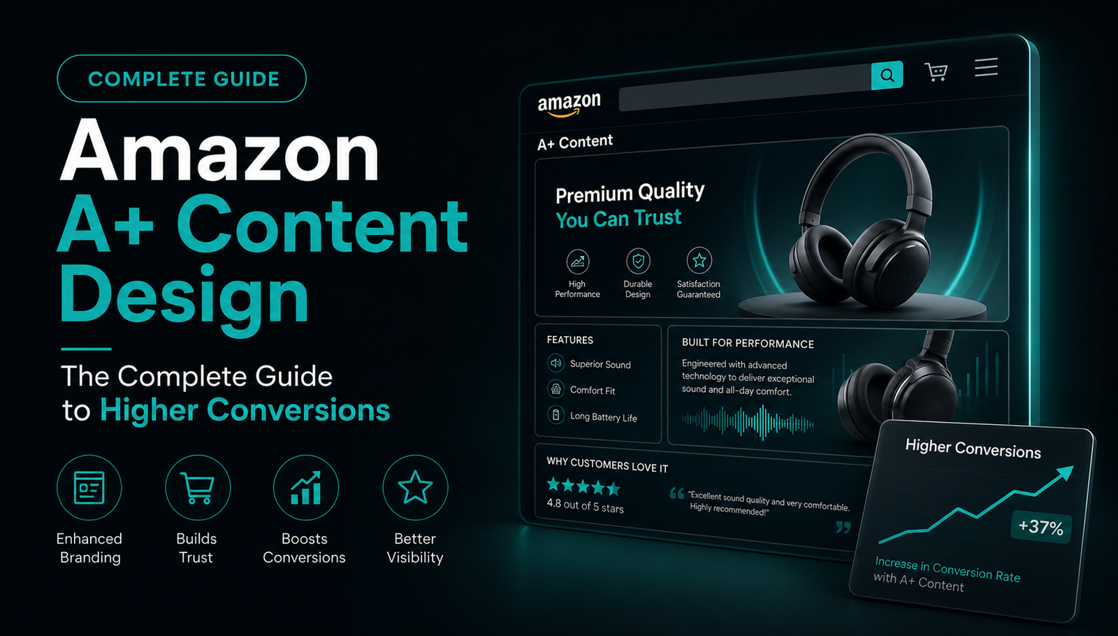
A+ Content (formerly Enhanced Brand Content) is the branded section below your Amazon product listing where you can add rich images, comparison charts, and brand storytelling. It’s available to any seller enrolled in Amazon Brand Registry — and it’s one of the highest-return design investments you can make.
Amazon’s own data shows that basic A+ Content can lift sales by up to 8%, and Premium A+ Content by up to 20%. But those numbers only show up when the content is actually designed to convert — not just filled in. Here’s how to get it right.
What A+ Content Actually Does
Your listing images earn the click and answer the fast questions. A+ Content does the deeper work: it removes doubt, tells the brand story, and pushes a hesitant shopper over the line. It also makes your listing look established and trustworthy next to competitors who left the section blank or basic.
The Building Blocks of High-Converting A+ Content
Great A+ Content isn’t random modules stacked together — it’s a designed flow. These are the elements that consistently move the needle:
- A strong brand banner. The first module should instantly communicate who you are and why you’re different.
- Benefit-led feature blocks. Turn dry specs into clear, visual benefits the shopper actually cares about.
- A comparison chart. Position your product against alternatives (or your own range) to guide the choice.
- Lifestyle imagery. Help the buyer picture the product in their own life to build desire and trust.
- A brand-story module. A short, human reason to trust you — especially powerful for newer brands.
“Blank A+ Content is a missed sale. But badly designed A+ Content is worse — it makes a good product look amateur.”
Design Rules That Separate Good From Forgettable
The difference between A+ Content that converts and A+ Content that just fills space usually comes down to a few disciplined design choices:
- Design mobile-first. Most Amazon shoppers are on a phone. Text that reads on desktop often disappears on mobile.
- One message per module. Don’t crowd. Each block should make a single point clearly.
- Keep the brand consistent. Colours, type, and tone should match your listing images and packaging.
- Follow Amazon’s specs. Correct image sizes and resolution so nothing gets rejected or looks blurry.
Basic vs. Premium A+ Content
Basic A+ Content is free for Brand Registry sellers and already gives you branded modules and images. Premium A+ Content unlocks larger images, interactive modules, video, and hover features — and carries a bigger conversion lift. If you have access to Premium, a well-designed layout is well worth it; if not, a strong basic layout still outperforms a blank listing every time.
A+ Content Is Part of One Connected System
Your listing images, A+ Content, packaging, and storefront should all feel like the same confident brand. When a shopper scrolls from a scroll-stopping main image into clean, benefit-led A+ Content that matches your packaging, every step reinforces the last — and that consistency is what turns a click into a sale, and a buyer into a repeat customer.
Want This Done For Your Brand?
Book a free 30-minute call and we’ll review your packaging together — no pitch, just honest feedback.
Book a Free Call

